

 |
|
||||||||||
| |
 |
 |
|
 |
 |
|
|
||||
| |
|
 |
 |
|
|
 |
|
||||
| |
|
||||||||||
| |
|
|
|||||||||

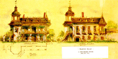
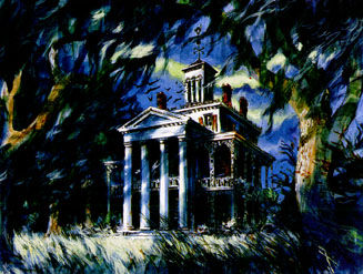
| Our beautiful home - its first incarnation, anyway - was constructed in 1962-63 in the Magnolia Park/Fowler's Harbor section of what became Disneyland's New Orleans Square (in 1966). The building was originally intended to house an inclusive walk-through attraction in development at the time of construction. The exterior concept evolved from vague notions of a "spook house" to be nestled in one of the Main Street, USA alleys, to a New England-style manor house, to the current, existing design you see today in New Orleans Square. Early themes for our "haunted mansion" were inspired by concepts as varied as the 1949 animated adaptation of The Legend of Sleepy Hollow, Sarah Winchester's labyrinthine Llanada Villa in San Jose, CA, and a pair of screwball Bob Hope ghost comedies. As the 1950's progressed, the attraction evolved rapidly. Early walk-through concepts by Ken Anderson ca. 1957 included the story of the pirate-sea merchant ("Captain Gore") and his unfortunate bride ("Priscilla"), which most likely inspired the nautical touches on our Mansion's exterior, such as the Captain's Walk on the roof and the ship-shaped weathervane atop it. |

 Sam Mc Kim painting on copy of Ken Anderson drawing, 1958. |
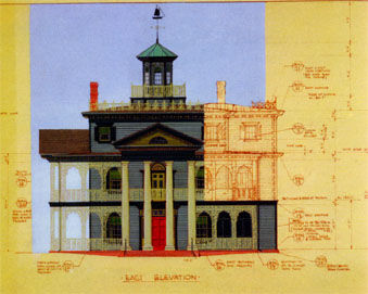
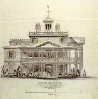
The style of architecture is antebellum Classical Revival, utilizing the columned pronaios porch façade (complete with triangular pediment atop) popularly associated with plantation houses of the Old South. Ken Anderson, the artist who conceived this exterior, captured the essence of many of the stately mansions along the bayous of the Mississippi River delta, surprisingly, by basing his design on at least two early-nineteenth century houses in Baltimore, Maryland. One structure - the historic Evergreen House - was owned by the Garrett family, and bequeathed to Johns Hopkins University in 1942. Photos of the other Baltimore mansion (the Shipley-Lydecker House) were included in an architecture and design collection compiled by Frances Lichten and housed in the WED library. Some people claim that Anderson was also inspired by the Stanton House (built 1857) in Natchez, MS. See a picture on our FAQ page. |
| Our Mansion's Severan wrought-iron balustrades would blend nicely with those to be installed in the New Orleans Square section of Disneyland, located next door. Anderson's initial concept drawing, however, was a shocking contrast to the pristine exterior we see today. Initially, Anderson envisioned a ruined, overgrown house abandoned to the whims and eccentricities of the weather. Walt Disney (the benefactor of our wonderful crypt-community), took one look at the drawing and commented that it looked too run-down for his park. Let the ghosts take care of the inside, he reasoned, and we'll take care of the outside. |
| As you may suspect, many of our accommodations are located in a separate "show building," behind our mansion façade. Since the 1960's, construction at Disneyland has trended "outside the berm." That is, many attractions (including our Mansion) were constructed outside of the park areas visitors see. Work on our Mansion was delayed as the imagineers were assigned to attractions intended for the 1964-65 New York World's Fair, leaving our original Mansion building empty until elevator construction began in 1969. Show work resumed after the Fair attractions were completed, but the bulk of the decisionmaking occurred after Walt Disney's death in 1966. At that point, it had been established that the elevator system - and the extra-berm show building it would allow guests to access - would be a necessity. It wasn't until 1967, however, that the true character of our home would be catalyzed. The success of the Omnimover - aka "Doombuggy" - transportation system developed for "Adventure Thru Inner Space" introduced a radical new way of presenting a show, thereby requiring attraction designers to re-think scene arrangements beyond the limits of the original walk-through concept. These Omnimover-Doombuggies were designed by several WED imagineers (including Bob Gurr) and the ArrowDynamics Corporation. |
 Pre-1963 Color diagram. |
 South Elevation by Marvin Davis, 1961. |
Since the building's construction, we've added a number of interesting touches to the exterior. The second-floor balcony, which wraps around the frequently-viewed south and east façades of the building, is adorned with charming white wicker furniture, a staple in semi-outdoor settings of the Victorian era. Hanging plants, a barometer, and a telescope poised to view the riverbend (alas, now gone), have at times completed the general look, reminiscent of the "sea-merchant-with-a-secret" theme abandoned in the final show concept. Up until 2005, the focal point of the balcony was the be-lilied mourning wreath hanging from the balustrade, flanked by black crepe bunting, between the center columns of the pronaios. Added by Show Quality Imagineers during the sizable 1995 attraction refurbishment, these seemingly minor period details created a tremendous impact. The black fabric itself was dramatic in its simplicity, recalling the stark totality of the kind of mourning inspired by Queen Victoria's mourning for Prince Albert in the mid- to late-nineteenth century. The mourning wreath, replete with the stereotypically funereal Callalily, was a Victorian symbol of death - perhaps originally a quarantine warning - hung on the front doors of households in deep mourning for recent family losses. |